WORK
ABOUT
👋 Hello, I'm
Vera Chen
.
I create better experience for
users
People
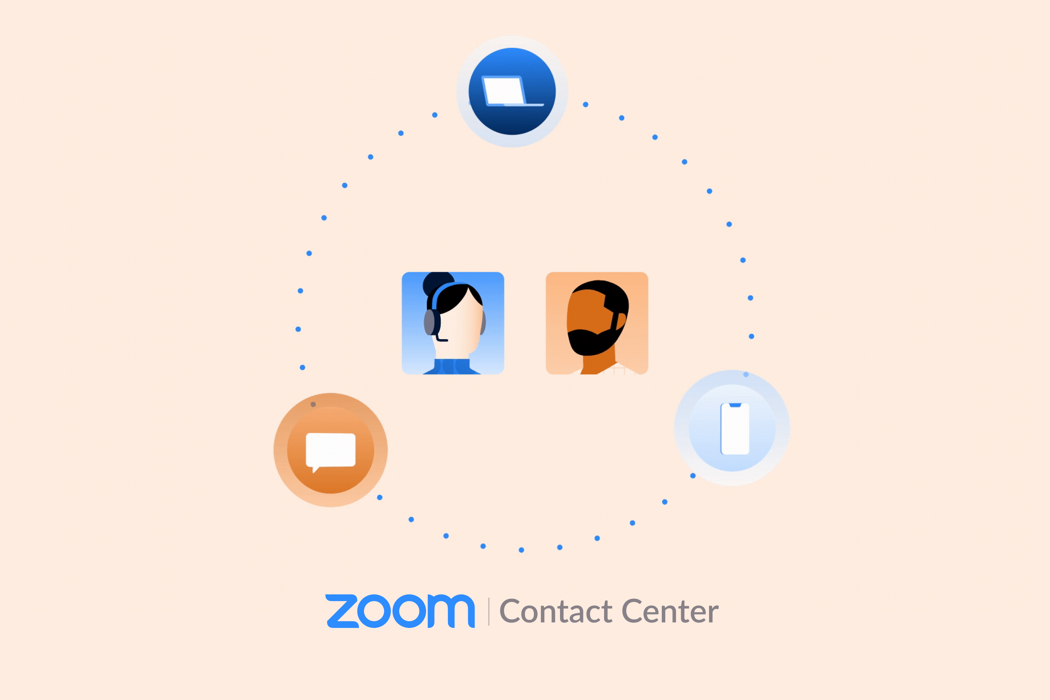
Building a Contact Center
Desktop App
Framework
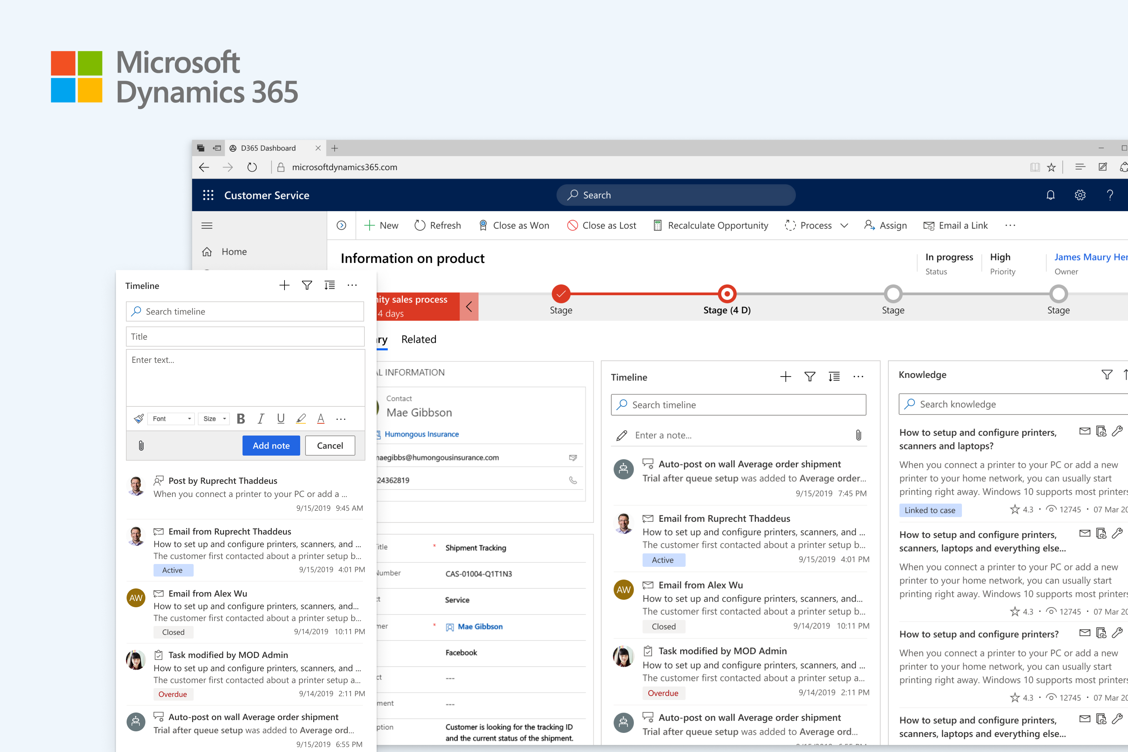
Timeline Customization
Desktop
CRM
Favorite Driver
Mobile App
iOS
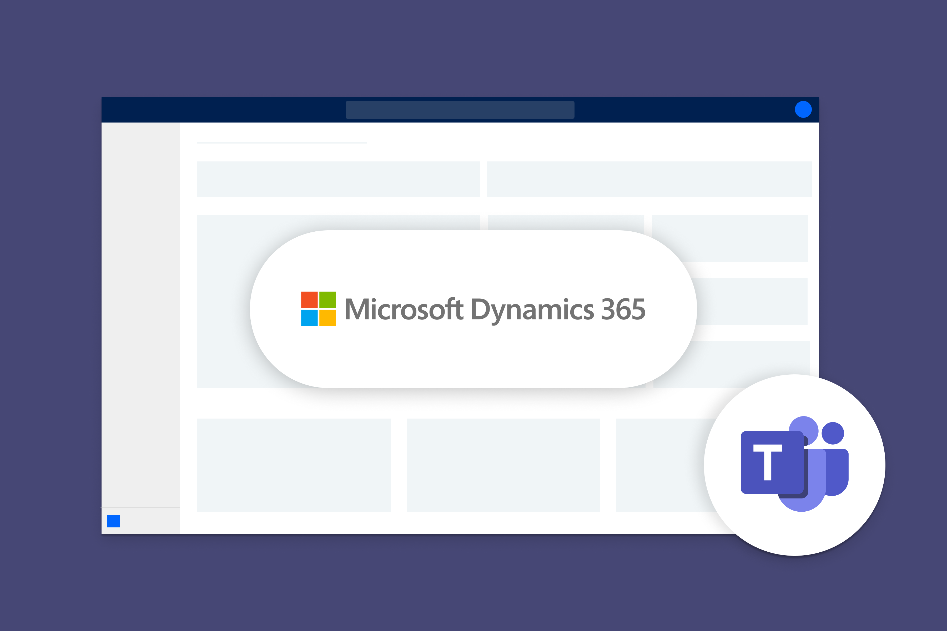
Microsoft Teams Integration
Desktop
Ignite 2021
Designing A Design Tool
Design System
Internship
Wedding Library
Mobile App
Side Project
From Marketing to UX
Key Takeaways