Wedding Library

Every love deserves a perfect wedding.

Project Background

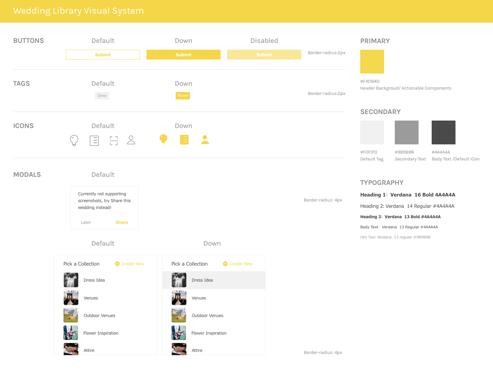
Working as the only Designer in the team, I designed and prototyped the first version of a wedding service platform for a Seattle-based startup. From April to June, 2018, I established the design system, iterated the product structure, and refined several versions of design. Mainly targeting Chinese couples, I designed the app in Chinese. As planned, the app will be launched by the end of January.

Hengxiu Gao (Front-End Engineer)
Jianjian Bu (Back-End Engineer)
PracticesUser Research, UX & UI Design, Prototyping
Methods & Tool
Survey, Secondary Research, Competitive Analysis, Sketch & Principle
Role
Product Designer
TEAMMATES
Murphy Zhai (PM)
Diana Dai (Operations)
Date
April-June, 2018

Context

Chinese couples refuse to follow the traditional wedding style

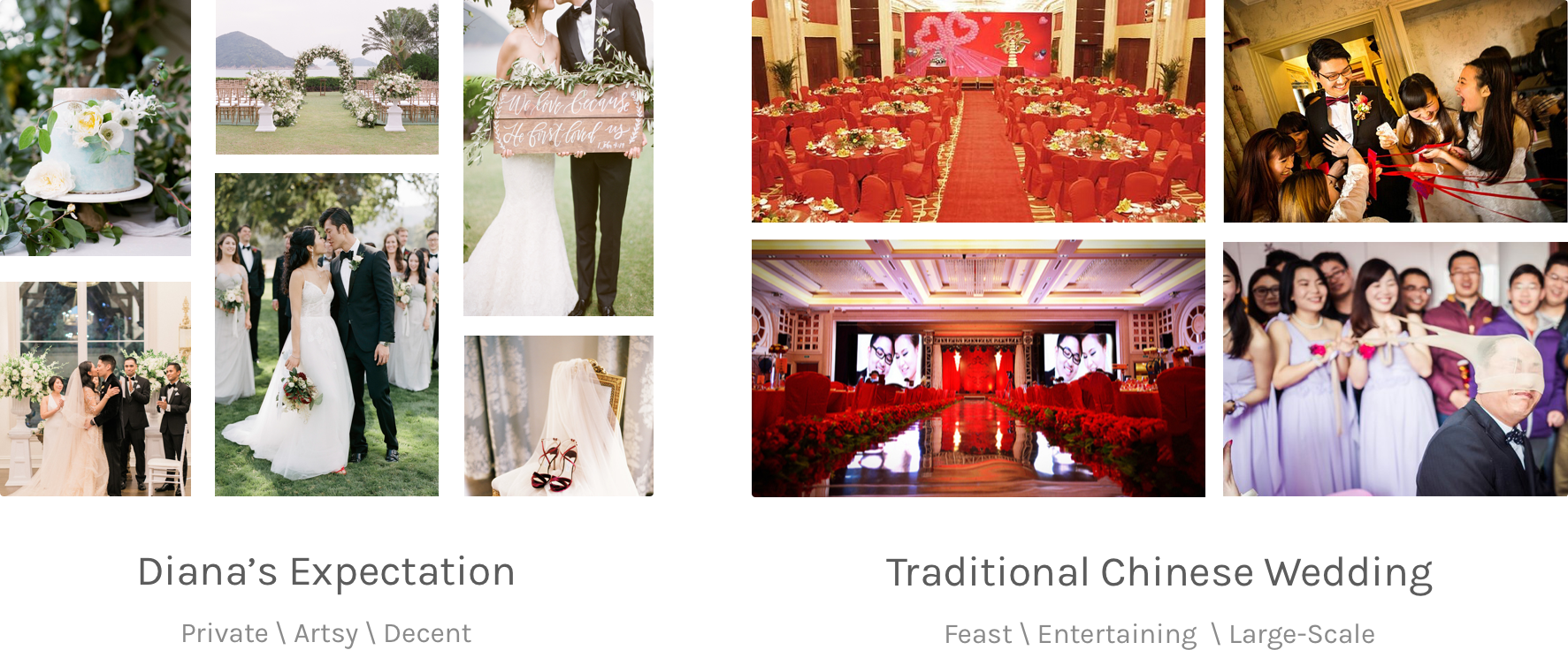
Murphy and Diana just got married last year. They held two weddings, one in Texas, Austin, the other in Chongqing, China. It took them several months to plan the first wedding, from renting the venue to choosing the flowers. They ended up with a gorgeous wedding. Exhausted but grateful, Murphy and Diana were expecting a similar wedding to celebrate with their families and friends at hometown.

However, it was hard to find vendors at second or third tier cities in China that provides family-style wedding services. The traditional Chinese weddings still dominate the market and Murphy and Diana had to compromise and follow the traditional rules and process. Like  most couples did in China, they stood on the stage, laughed with the jokes, and initiated cheers to the unfamiliar guests of their parents.

“It was more like a performance rather than a celebration. ” Says Diana, “I think wedding is for us, and our families, not for a group of strangers who never met me before.”

Back to Seattle, Murphy and Diana decided to dive deeper into the Chinese wedding market. They hired me as the product designer of the team. To start with, we want to understand how couples currently plan their weddings and if other couples have the similar frustrations as Murphy and Diana did.

Process

Discover, Define, Design, and Deliver

We followed HCD process by first conducting user research. After synthesizing inspiring insights from survey and interviews, we defined the problem and jumped right into the ideation phase. From sketches all the way into fidelity prototypes, we gradually created the first version of the application. Right now, we are conducting usability testings and will iterate more based on the feedback we receive.

Research

Traditional wedding vendors are transforming to independent studio.

According to the secondary research, even though the total numbers of weddings in China decreased these years, the consumption level significantly increased. The wedding market in general is going through a transformation from streamlined & standardized product into narrowed-down & customized services.

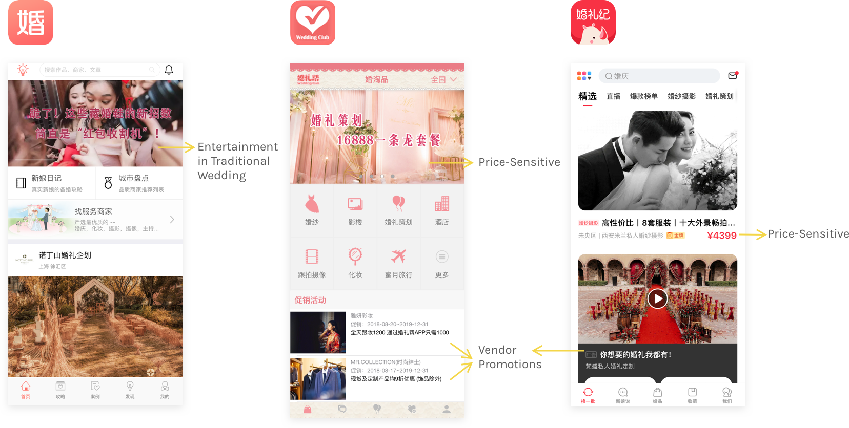
However, current wedding products are still dominated by traditional vendors and services.

We downloaded some top-rated wedding products and found out that most of them are still promoting traditional wedding style and related services such as venue rental, photography, and wedding host. Other than the bold highlighted sale price, couples are unable to find photos or case studies of each vendor promoted.

People don't know where to find inspirations or the ideal vendors.

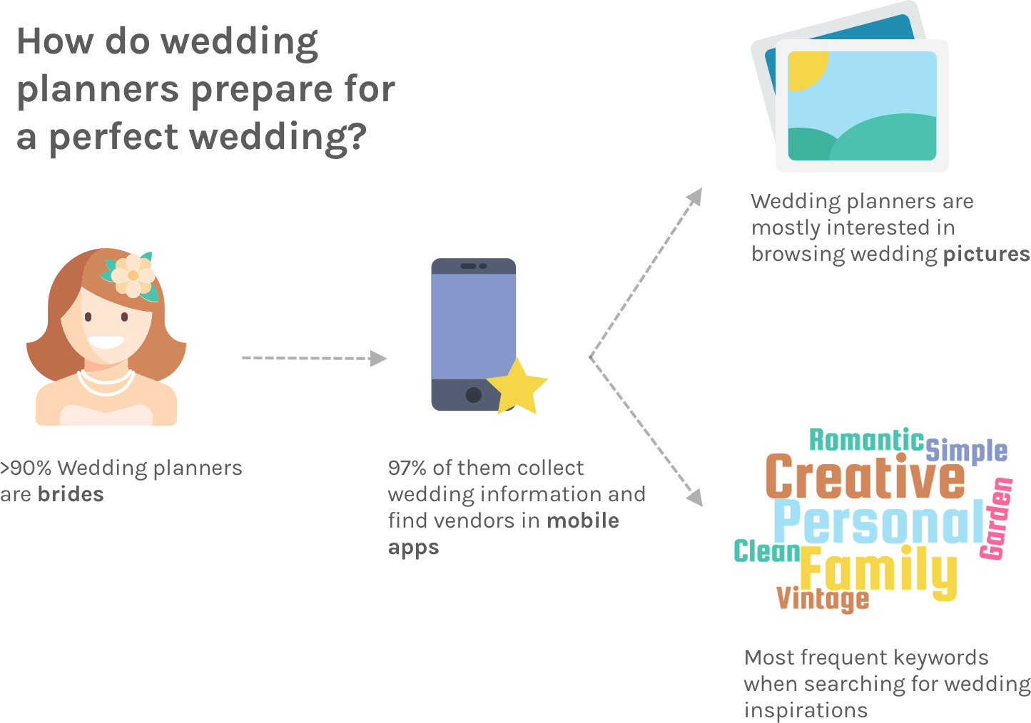
Then we sent out a survey and conducted interviews to learn how people currently prepare for their weddings. Interestingly enough, more than 90% wedding planners are female, and they spend most of their time browsing wedding pictures and save contact information of preferred vendors. However, they don't know exactly where is the best place to search so they just follow the official account of some famous wedding studio on the social media and gradually learn more about similar studio/vendors from the platform recommendations.

Design Goals

How might we help couples find wedding inspirations and better plan for a personalized wedding?

Based on the research, we think that there is a gap between products available in the market and people's expectations. Currently, people are looking for a place where they can collect wedding inspirations, find preferred vendors who has a similar taste, and be able to personalize their weddings.

Design Problems

Two major UX problems to tackle

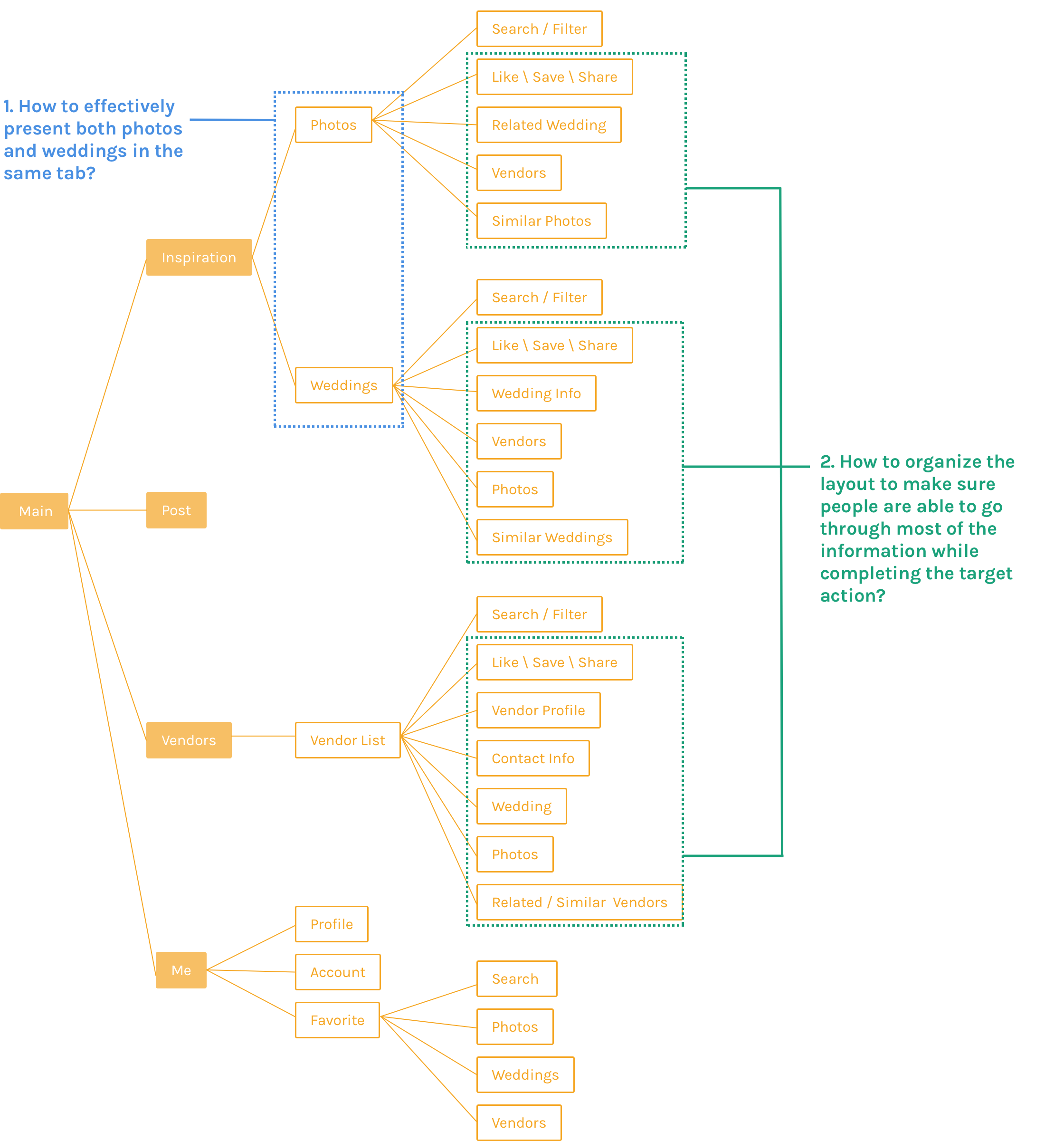
Based off of the design goals, I received an information architecture generated by my Product Manager. I found two outstanding design problems waiting for me to tackle. Firstly, "Photos" and "Weddings" are weighted equally in one tab called "Inspiration". I need to find a way allowing people freely toggle through these two features, and following the design pattern in the meantime.

Secondly, each page includes a long list of content to show, while having a primary target action prompting people to like, save, or share the content. I need to find an optimal layout or interaction to encourage people take the target action while browsing the content.

Design Decisions

#1 Toggle between Photo & Wedding

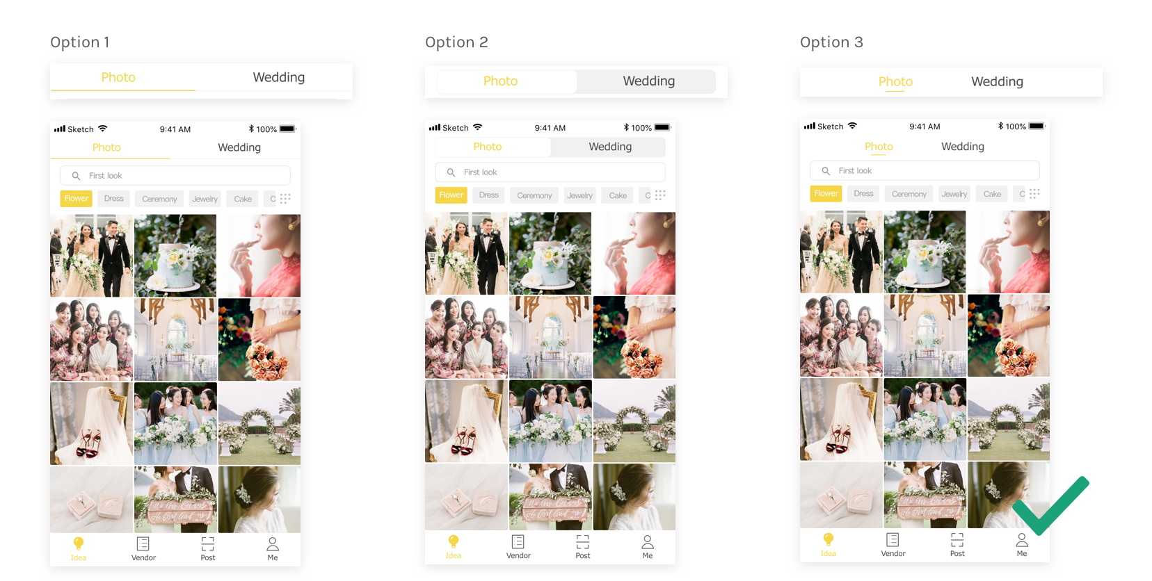
As the "Photo" and "Wedding" pages weight equally under "Ideas" tab, which is also the front page, I need to find a solution facilitating people to naturally switch between each other. Initially I proposed three options as below. I opted out of the second option as the toggle switch is used more often in a setting page to switch on and off a feature. Then I made a decision upon the third option, rather than the first, because a segmented control with shorter focus indicator (the underline) makes the UI cleaner and easier for people to identify the content hierarchy.

#2 "Stick" to the Target Actions

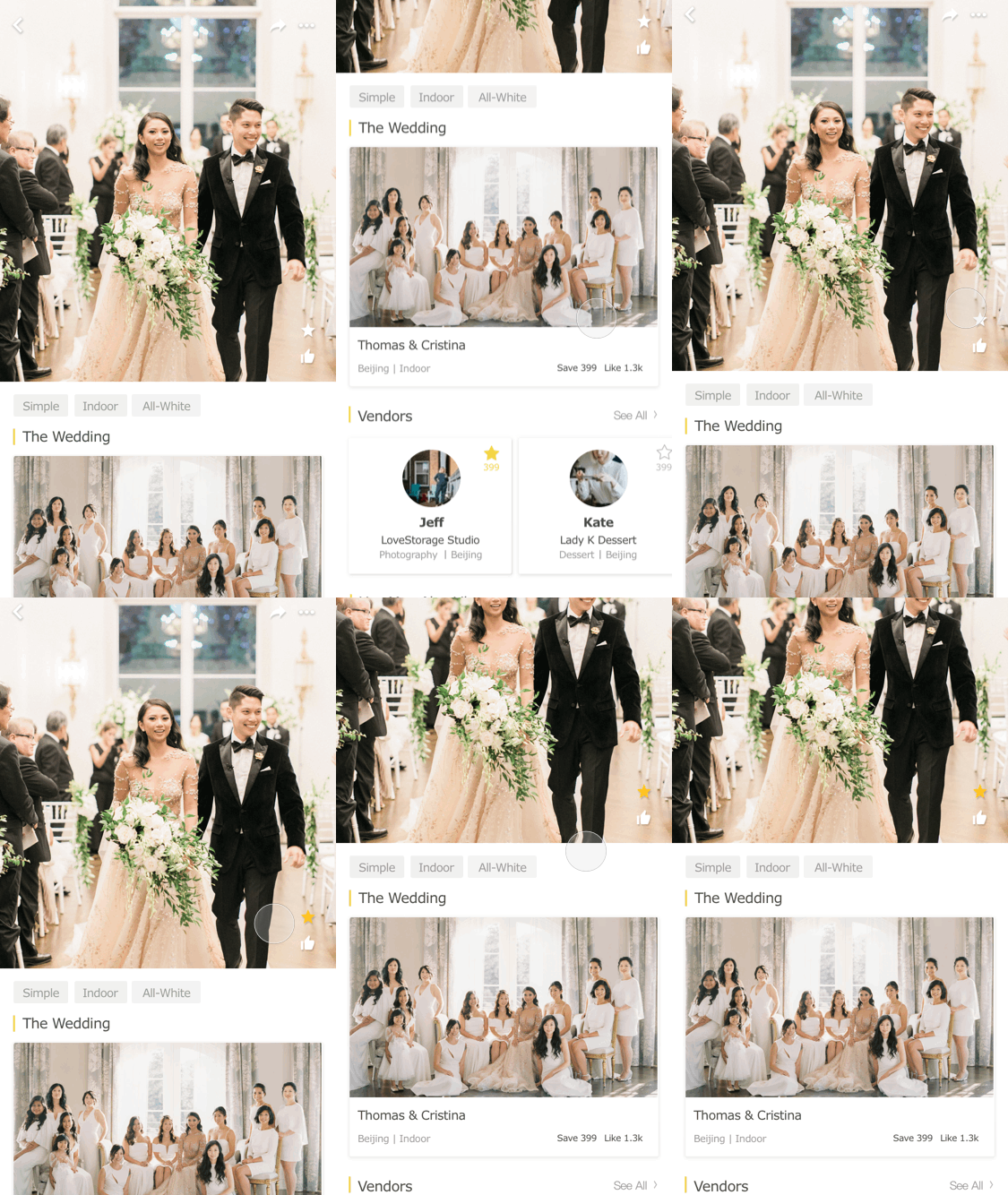
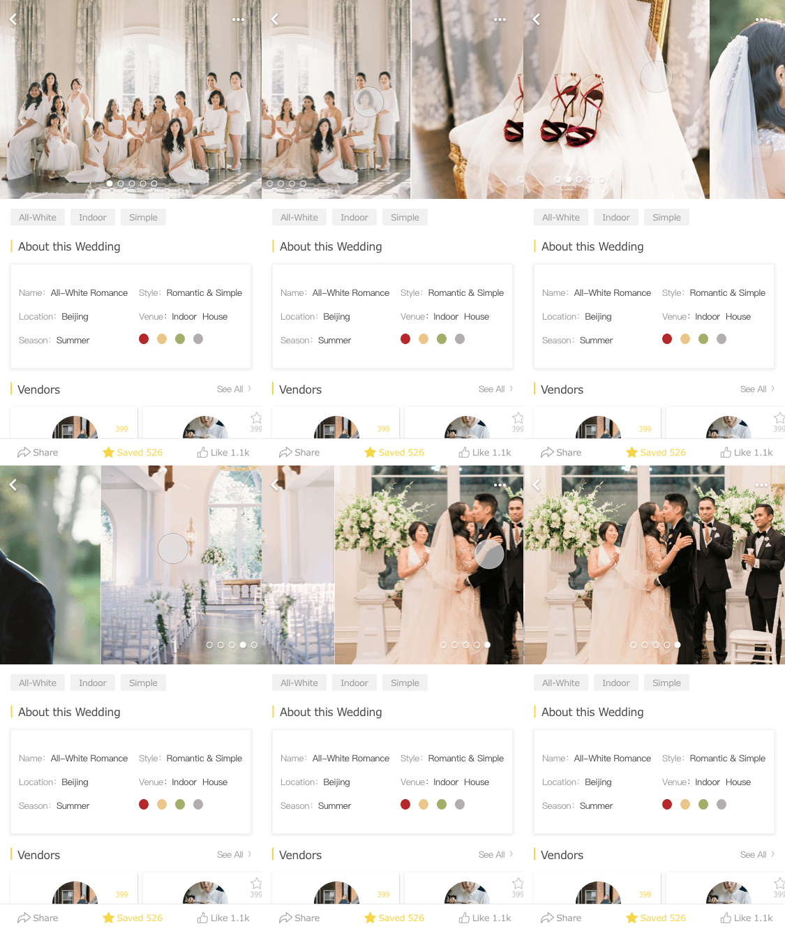
With the design goal of making wedding planning more personalized, we encourage people to share and save their ideal wedding cases. Initially I put the save, like, and share options on the cover photo of a wedding case. Then I realized from the testings that people are easily distracted by the content down below. After scrolling, people tend to click on the vendors info or browse similar photos and forget to save or like the previous content.

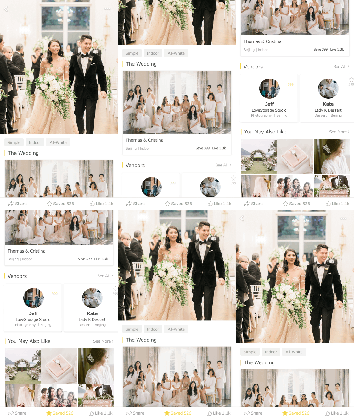
To solve that distraction, I moved the action buttons to the bottom and make them sticky to the screen, so that wherever people are scrolling at, they will always be able to conduct the target actions as we expected.

#3 Hide Content for a Better Experience

Later on in this project, I had a small conflict with my PM. He insisted that we should show every photos in full size within each wedding case. However, it would create a really bad user experience for people to scroll all the way down and most likely ignore the rest of the content half way. So I fold and hide the photo in a scrolling showcase on the cover spot. I limit the number of photos to five and allow people to browse all photos by adding a "view all" option at the end. Eventually I convinced my PM by conducting usability testings and learned that sometimes we have to compromise and hide content in order to gain a better experience.

Showcase

Pursuing the pixel-perfect craftmanship

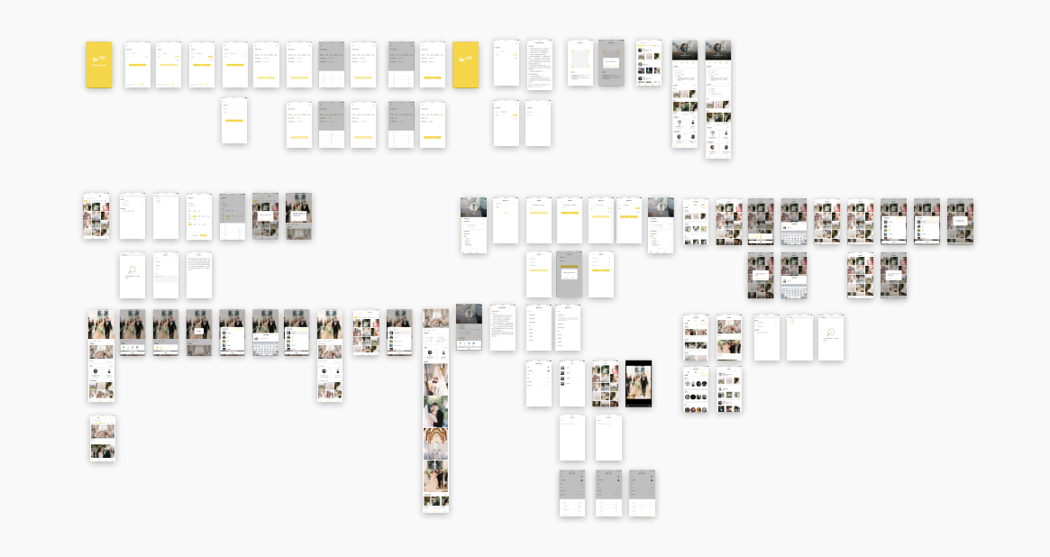
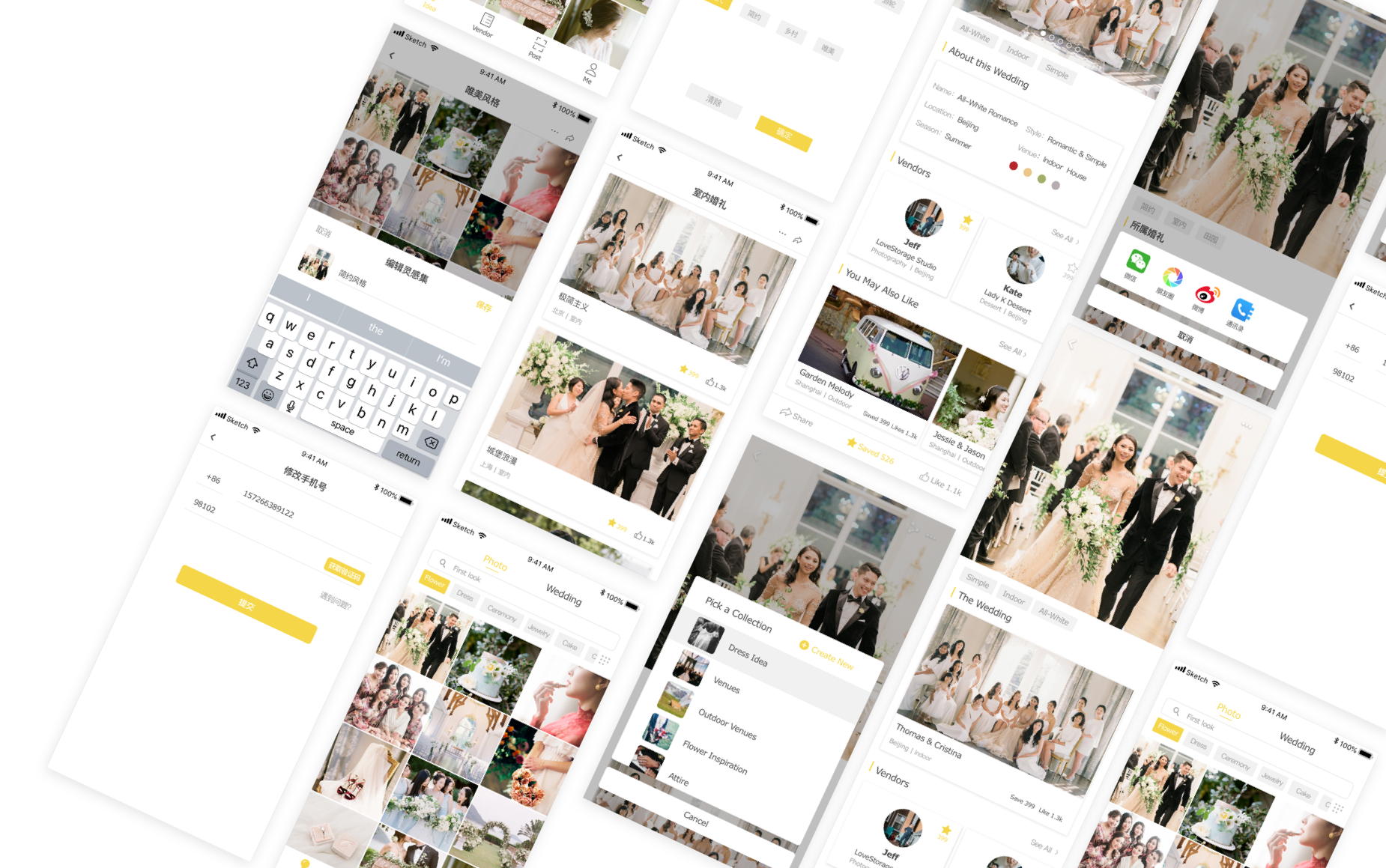
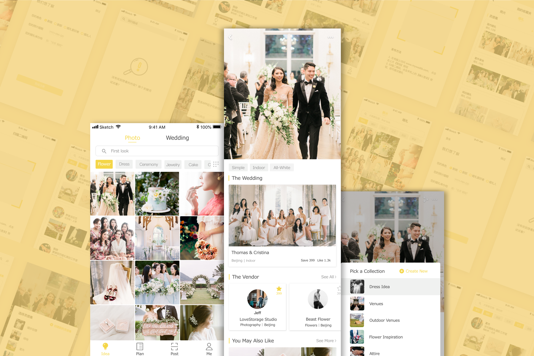
By the end of the three-month project, I delivered the design specs of the first version product. PM and researchers are conducting usability tests and we will iterate based on the feedback we received.

Reflections

Early stage product = more flexibilities but heavier workload

It was the very first time for me working as the only designer in a startup team. I was able to have more space and flexibilities to explore design options and user interactions but I also needed to mock up every single screen for development. Although it was tons of work, I practiced designing flows that are usually ignored in short-term school projects, such as on-boarding, account settings, and profile setup flows. I've gained a holistic view of a mobile application in terms of end-to-end experience and product strategies.

Internal communications drove the project
This was also the first time for me to directly communicate with Engineers and PM. I explored a plugin in Sketch called SketchMeasure that can export code and design attributes for Engineers, which reduced a lot of workload for me to walk through and mark up my design specs. With PM, however, I spent quite amount of time discussing and reviewing both visual and interaction designs. I learned how to effectively convey my rationale and justify the design during the discussions back-and-forth, and I also realized that efficient and open internal communications would motivate the teammates and drive the entire project going towards a better direction.